ActionPad Quick Guide
The following is a guide on how to use the many powerful features included in ActionPad. If you have not yet set up the ActionPad Server software, please go here for setup instructions.
Create and Customize Panels
Create Panels
After you have completed the startup tutorial, you will be presented with a blank panels screen that may look like this:
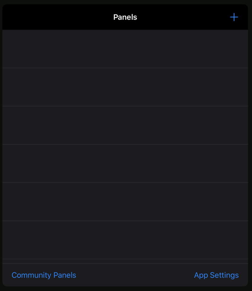
You may be wondering what to do from here. Why not start by creating your first panel? To create panels, tap the cross in the top right corner of the screen.
You will then see the new panel screen that looks like this:
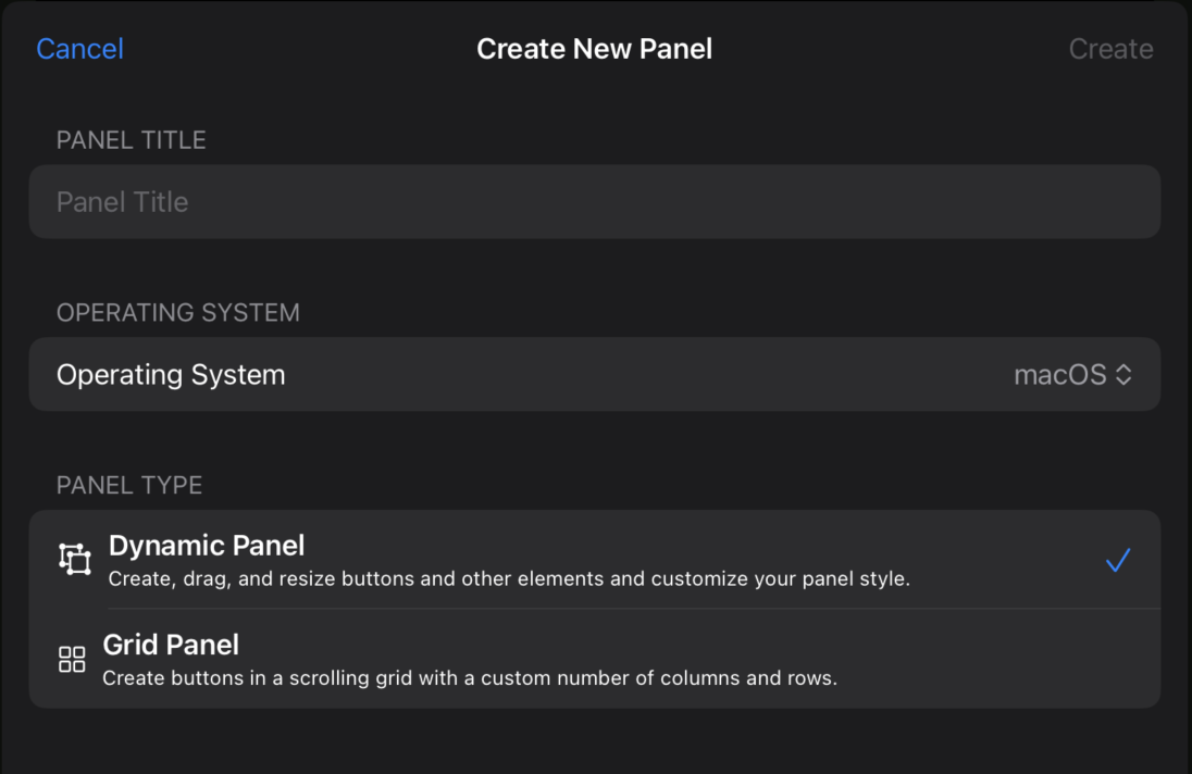
Here you can give the panel a title and choose the operating system which you wish to control.
You can choose between two panel types: Dynamic and Grid. Dynamic panels allow you to arrange buttons, text, images, and containers however you would like on your device's screen. Once you are done, press create and you should see a blank screen. From there, press the edit button in the bottom right to enter edit mode.
Editing Dynamic Panels
The Edit Mode Toolbar
This toolbar has everything you need to customize objects on your panels.
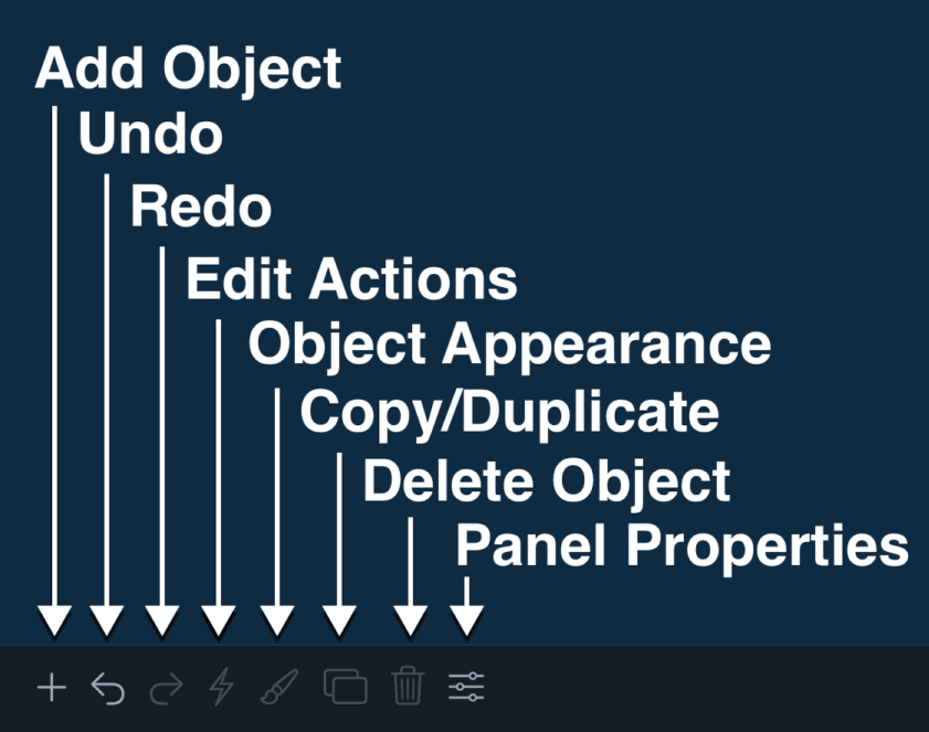
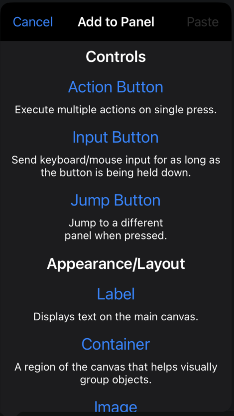
Add Objects
Using the add objects button, you can add a variety of objects to your panel. There are two types of objects: controls, which let you execute actions to control your computer, and appearance/layout objects, which have no functionality other than to improve the appearance of your panel.
Customize Objects
When you select an object on the panel and select the paintbrush icon, you will be presented with the object's properties screen. Here you can customize visual aspects of the object, such as border size and radius, icons/text, colors, and more.
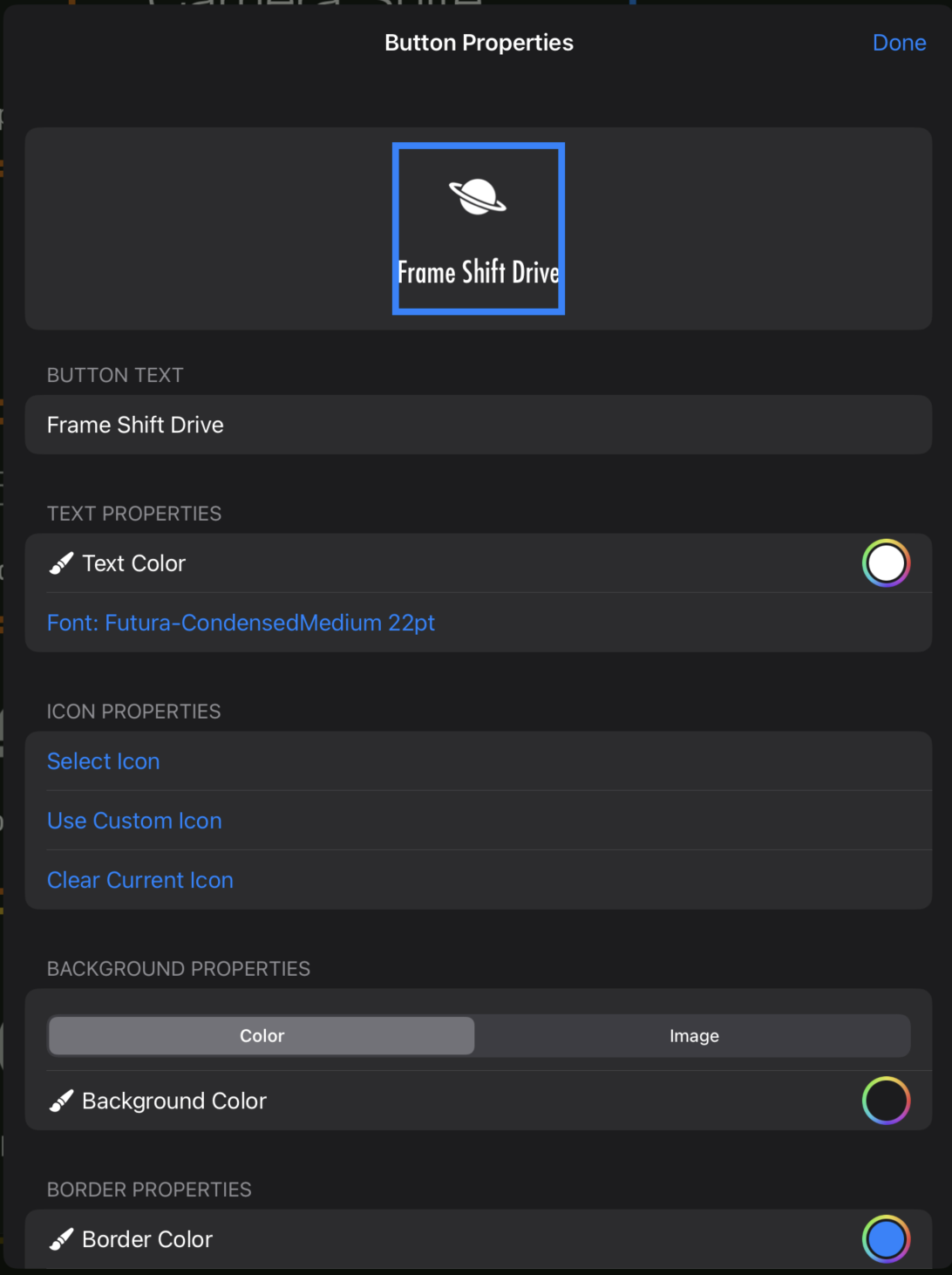
Along with customizing the object, you can enable size lock, which will prevent the object from being resized on the panel.
Panel Properties
Along with customizing individual objects, you can customize the appearance and properties of the panel itself.
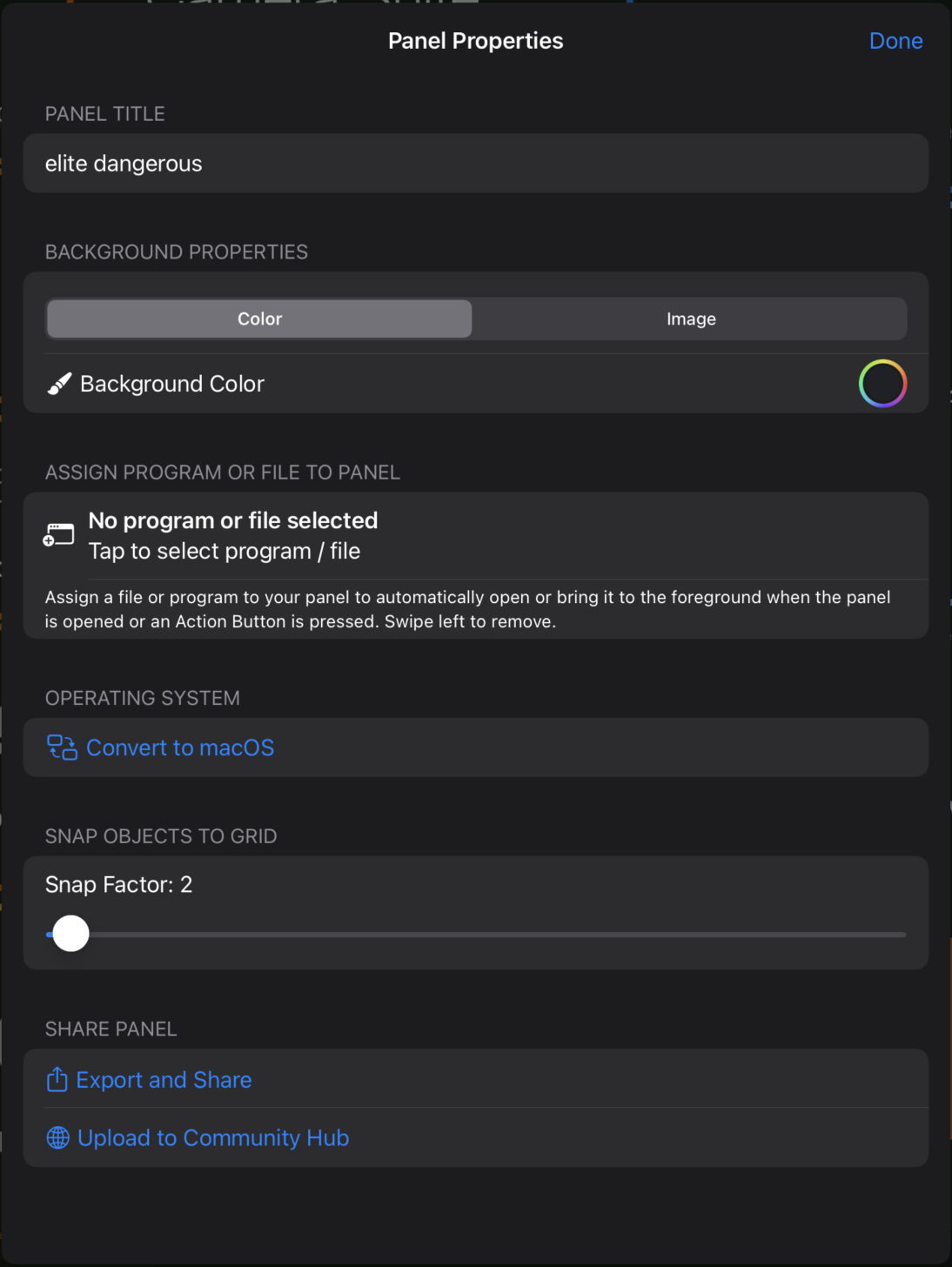
Along with customizing panel appearance, such as background color/image, you can also add a snap factor, which will snap individual objects' positions to the grid based on how high the snap factor is set (in pixels). Additionally, you can choose to convert the panel operating system, which gives you the ability to swap Ctrl/Command based on OS preference (Windows/Mac). From here, you can also specify an app, program, or file to launch or bring to foreground when the panel is opened or a button is pressed. This screen is also where you can share your panels on the community hub, or export your panel to share it privately.
Editing Grid Panels
Grid Panel Edit Mode
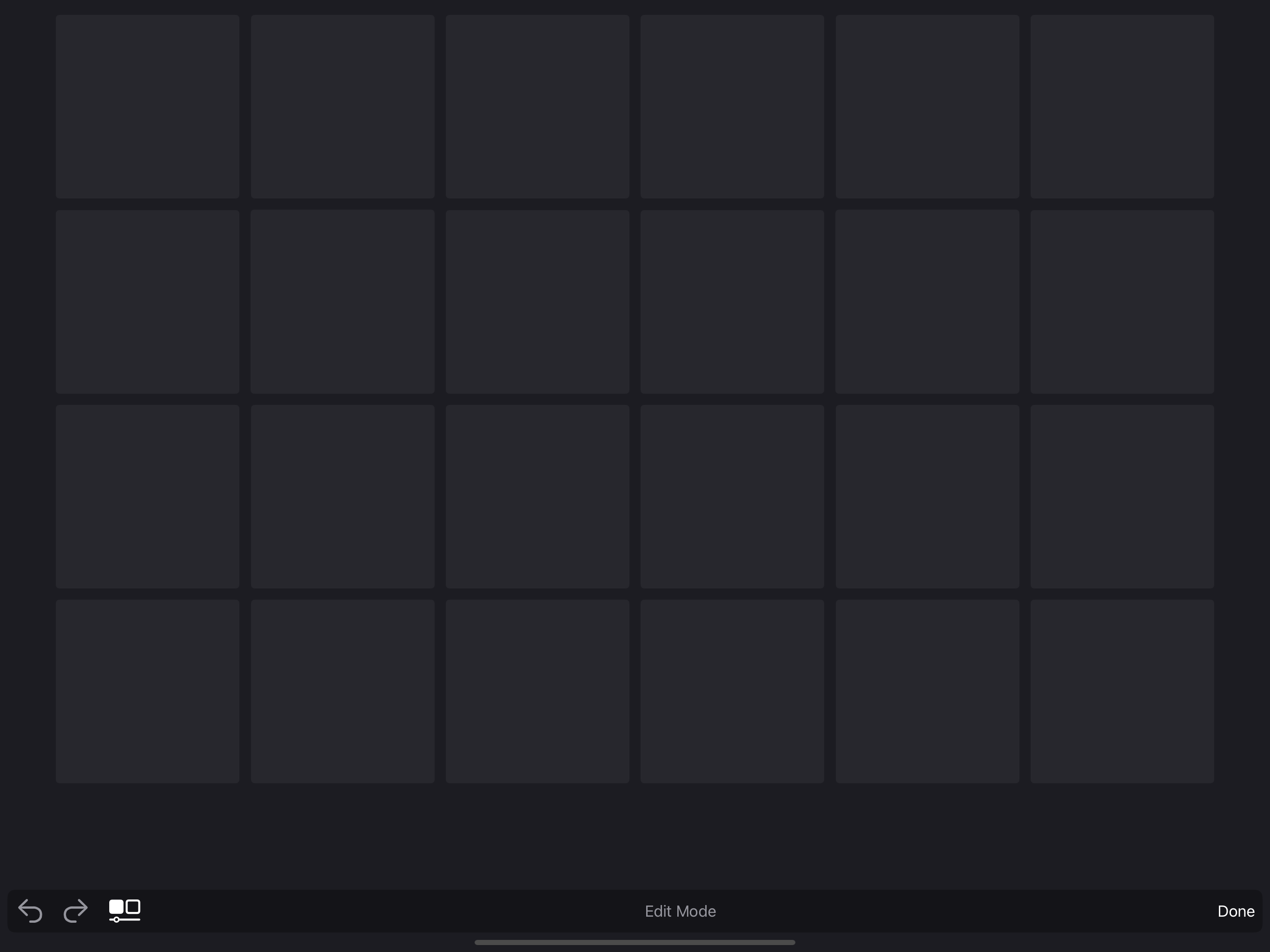
When you first create a grid panel, you will be presented with a blank grid.
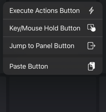
You can tap on any of the button squares to add a button. Just like in Dynamic Panels, there are 3 different types of buttons: Action Buttons, which execute a sequence of actions, Input Hold buttons, which will hold keyboard/mouse input for as long as you hold down the button, and jump buttons, which allow you to jump to a different panel.
Customize Buttons
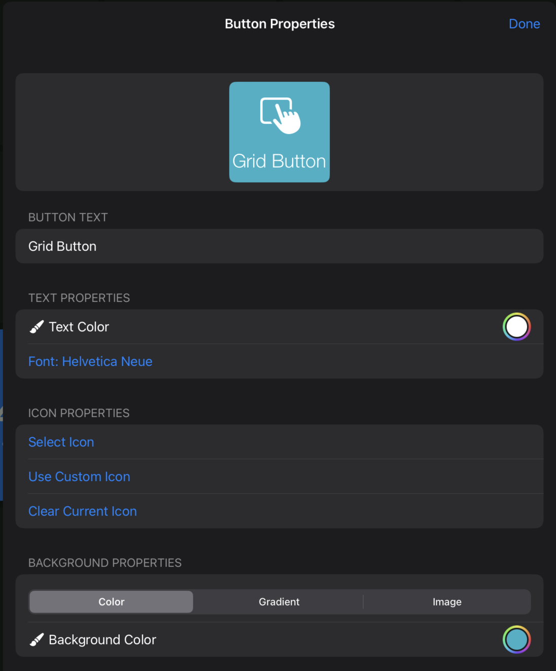
After you add a button to your grid, you can tap on it to view the button options menu.
When you tap on button properties, you will see the button properties screen, similar to the properties screen in dynamic panels. From this screen, you can edit the button's appearance. However, unlike dynamic panels, you cannot precisely control position or size.
Grid Properties
Grid panels have many properties that can be customized. You can customize the number of rows/columns, spacing between buttons, corner radius, grid background, and more. You can view the grid properties screen by pressing the properties icon next to the undo/redo buttons in the grid edit toolbar.
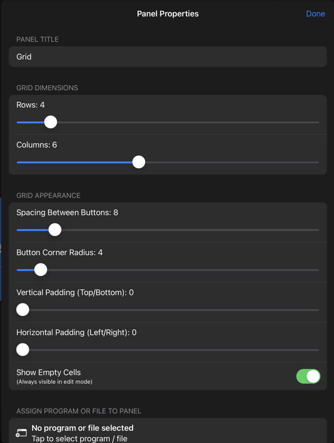
The grid properties screen contains all of the sliders needed for adjusting grid parameters, as well as your panel properties, such as assigning a program to bring to foreground when the panel is opened or a button is pressed. You can also export panels from here and share them to the Community Panels Hub.
Add Actions to Control Your Computer
Action Buttons
Action Buttons will execute multiple actions in a certain order in which they are placed, all with one tap. Action Buttons can be used for simple keystrokes such as Command/Ctrl F, or powerful macros combining both keyboard, mouse, and file/URL actions.
Actions are executed in the order they are listed, and delays can be placed between actions. Here is an example of the actions screen for an Action Button:
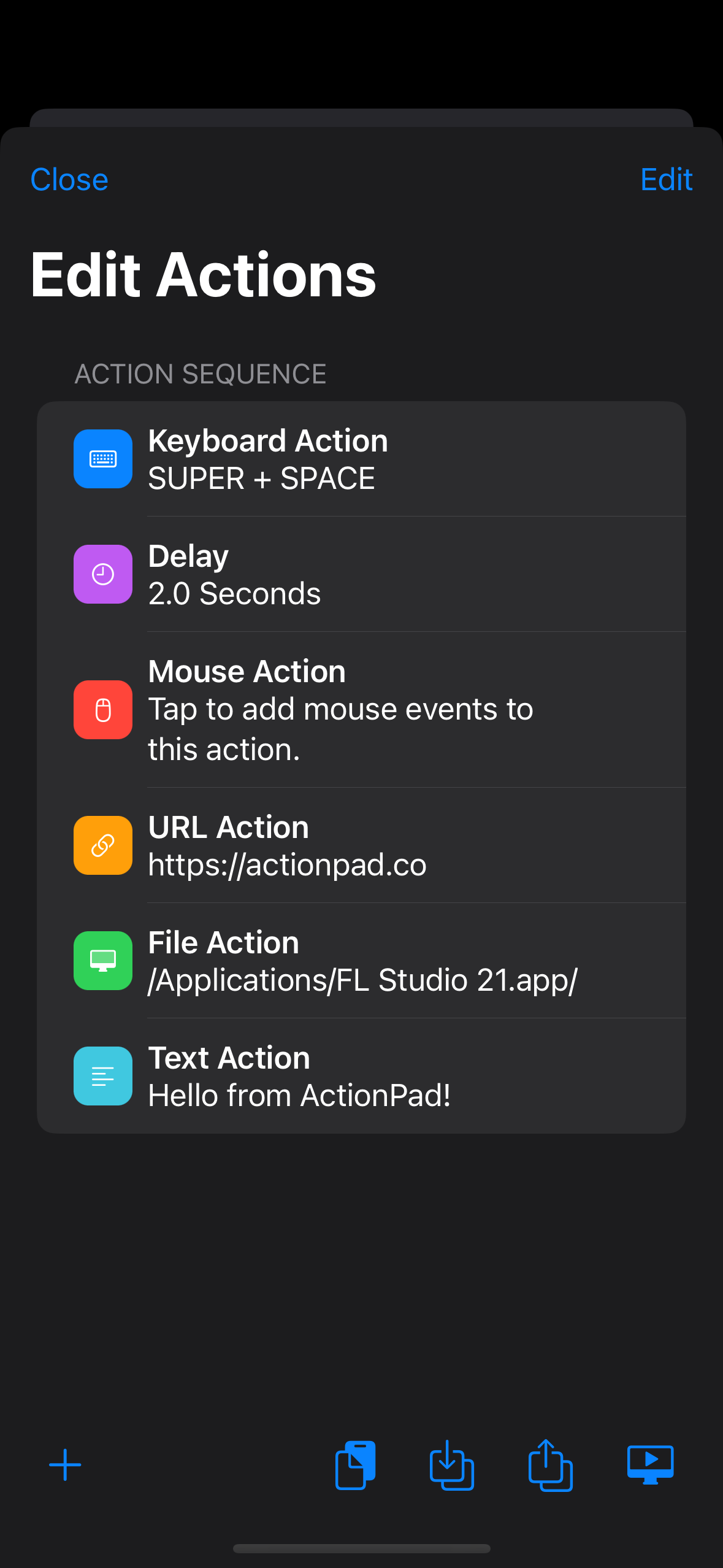
You can add actions to an Action Button by pressing the cross in the top right corner of the screen. To edit an action, tap on it. A screen should appear allowing you to set exactly what the action does.
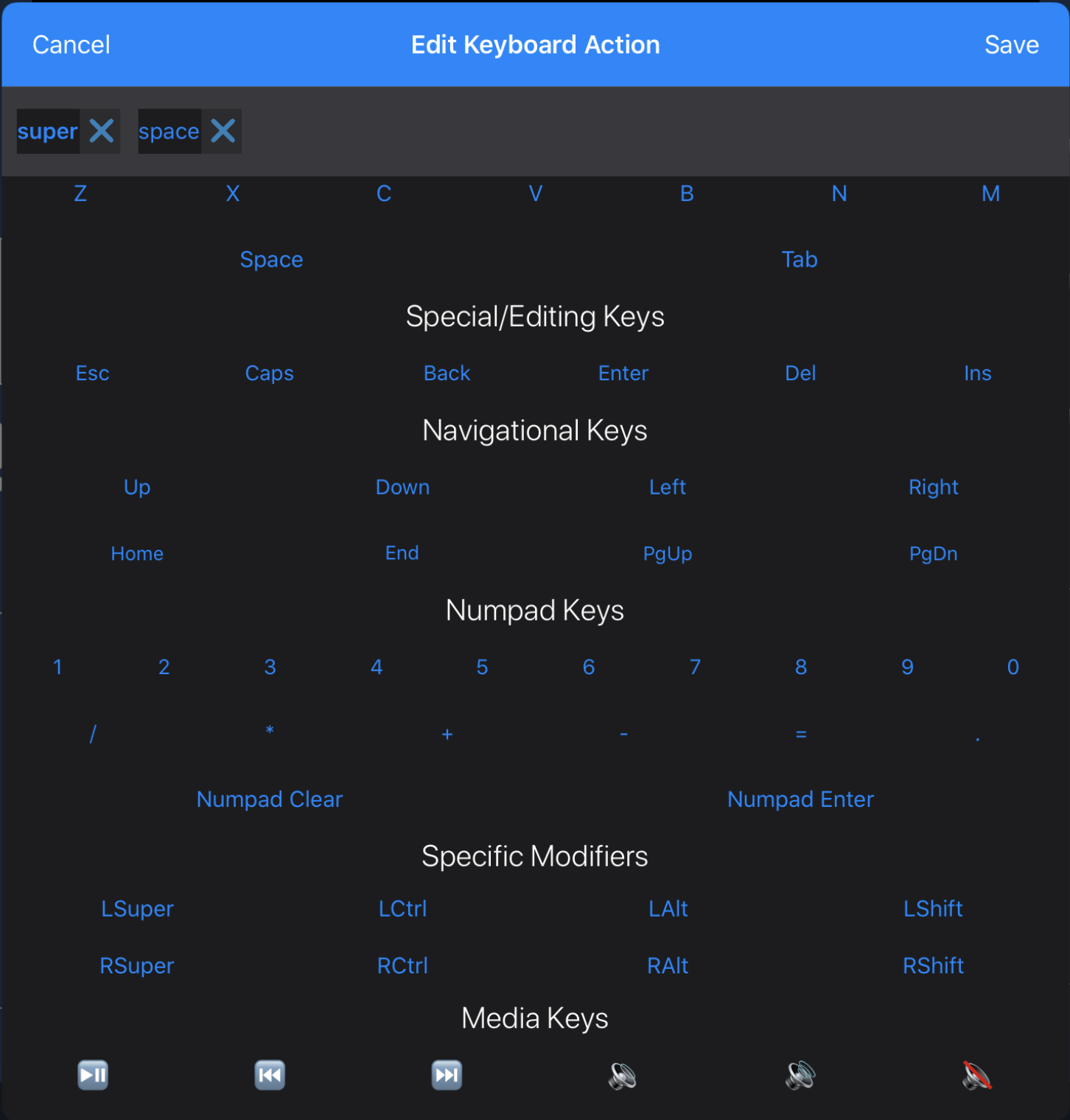
Keyboard Action
Keyboard actions are very straightforward: press the keystrokes you would like to execute, and the app will do so. You will have the option to hold down modifier keys until done. This will hold the modifier key down until all the other keys in the action have been pressed. This is useful for when you would like to execute keystrokes such as Command V or Ctrl Alt Delete.
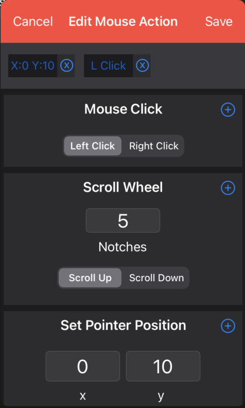
Mouse Action
Mouse actions allow you to control pointer position, scroll a certain distance, and execute clicks. It works similar to keyboard actions in that mouse actions will execute input in the order it is added. To add to a mouse action, tap the cross in the top right corner of the type of execution you would like to add after setting the parameters.
File actions, URL actions, and Delays
File and URL actions will open a file or application on your computer or a URL in your web browser. For files, you can browse your computer to choose a specific file rather than typing it in manually. For URLs, you can type in a web URL to open in your default browser, and for delays, you enter a certain amount of seconds for the delay to last.
Input Buttons
Input Buttons can be styled the same as Action Buttons, but instead of executing a set of actions on a single press, they will execute keyboard or mouse input for as long as they are held down.
When you edit the action of an input button, this screen will appear:
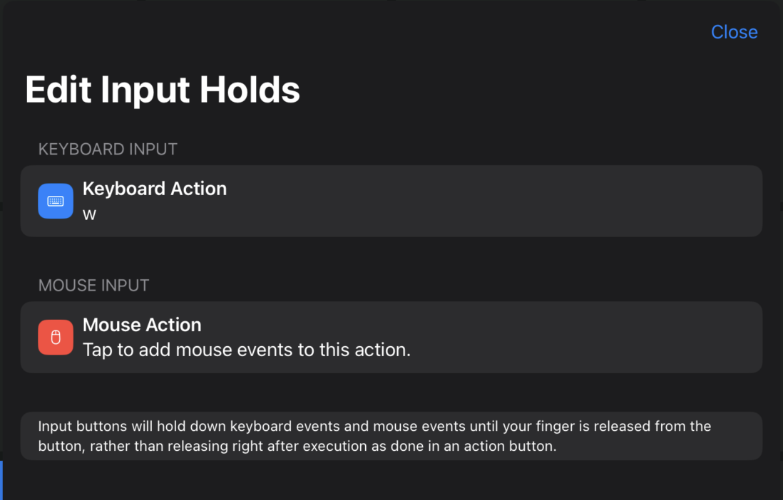
Keyboard Actions
Keyboard actions for Input Buttons use the same keyboard dialog as action buttons, but all keys are held down rather executing them in order like an action button. Because of this, the "Hold Modifiers Until Done" switch is disabled.
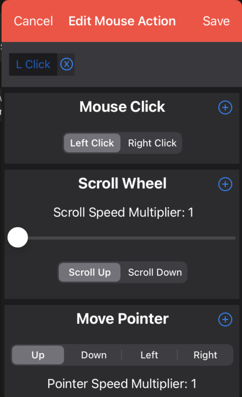
Mouse Actions
Mouse actions are different for input buttons. While they use a similar dialog, instead of setting the mouse position or scrolling a certain length, mouse actions can click, scroll, and move the pointer at a certain rate until your finger is released from the Input Button.
Share Panels
Using the Community Hub
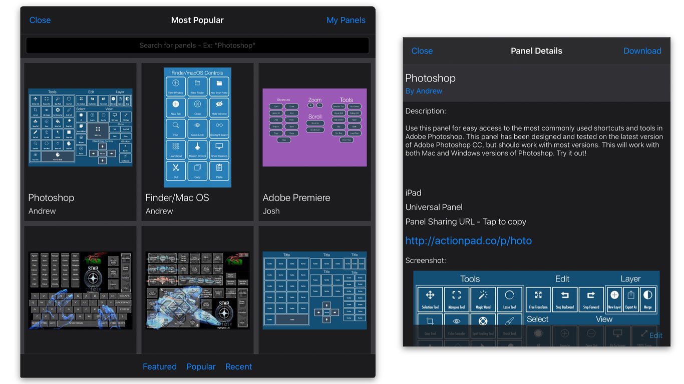
Get Panels from the Community Hub
ActionPad provides a free online sharing service known as the "Community Panels Hub". Here you will find user created panels for a variety of applications and screen sizes. The Community Panels Hub can be accessed by pressing the "Community Panels" button on the Panels screen. You will then see a gallery of user submitted panels, which you can sort by featured, most popular, and most recent. You can also search for panels.
Submit Panels to the Community Hub
To submit panels to the Community Hub, you will need to open the panel you wish to submit, go to the panel settings, and tap "Upload to Community Hub". To upload to the Community Hub, you will need an ActionPad account. If you do not have one, you will be prompted to create one or sign in before uploading. Once you have signed up/signed in, you will be presented with this screen:
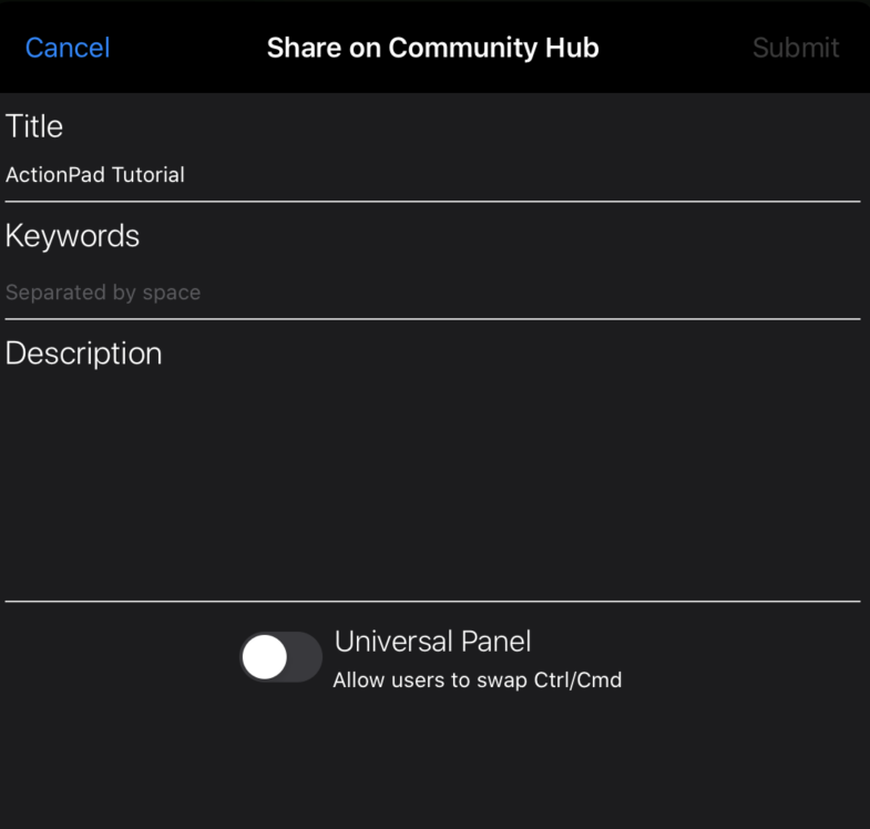
You will need to provide a title and keywords for the Community Hub. A description is encouraged, but optional. Additionally, when uploading please make sure your device is rotated to the preferred device orientation of the panel. You may select "Universal Panel", which will allow users to select an operating system upon downloading your panel. This will swap Ctrl/Command keys accordingly. Once you are ready to upload, press "Submit". Shortly after, you should see your panel available in the Community Hub for others to download.
Exporting Panels
Along with uploading to the Community Hub, you may also choose to export your panels as a file to be sent via E-mail, AirDropped, or sent through other installed apps you may have, such as Dropbox and Google Drive. When a panel is exported, to import it is as simple as opening the file on the device and selecting to "Open in ActionPad". Anyone else who wishes to use your exported panel will require the full version of ActionPad.
Any Questions, Suggestions, or Feedback?
Contact Information
For questions and inquiries related to ActionPad, please contact Andrew Arpasi, the developer, at andrew@andrewarpasi.com.
Thank you for using ActionPad!
If you enjoy using ActionPad, please leave a review on the App Store and tell your friends. I appreciate all feedback, questions, and support.
Created by Andrew Arpasi